Personal Evaluation

Out of the projects I have done this year, I am probably most proud of this one, although on lookers might look at the finished product and think it’s pretty basic, however this project allowed me to really learn a lot about code, specifically CSS and a little bit of JavaScript.

First off I’m more than pleased with the finished product and the client is also pretty happy with it, at the moment it’s looking like there are two options moving forward, the client will either use the site or, a third party has contacted hium about his website situation and there may be an opportunity for some collaboration between myself and them.

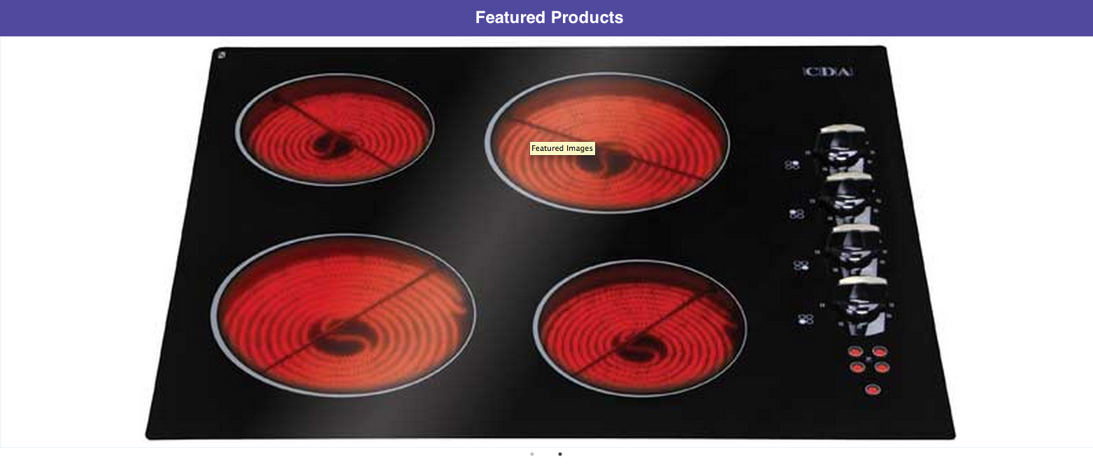
My primary learning on this project was code, I had to learn how to create mobile navigation and displaying for small screens only was a successful and actually enjoyable task. Next I learnt a lot about framework styling and how, actually it takes a lot of overriding the original styling to get elements styled how you want them. I also learnt a little about JS, in that, there was an issue with slick sliders that I implemented and I had to sift through and understand some of the code, to know what to eradicate. Lastly I learnt loads about media queries and creating responsive website, because I was having to make a lot of adjustments to elements to make the look good on a mobile screen.

I think I have definitely achieved what I set out to do in this project, I learnt to use foundation effectively, I implemented a simple CMS system and I learnt that even a little about client needs. With this project time management was also not an issue, I was able to fix issues and arrange client meetings in advance of the deadline, which I’m pretty pleased about.

Finally then, the presentation went fairly well, a point was made for a future improvements  upon the site, whereby I might implement some sort of animation overlay on banners with some information about products, because this is something the site is lacking at present. However overall I was happy with how this project has played out and it has reduced my fear of code a significant amount.

Client Evaluation

Tom Gilbert has done an excellent job of updating the MKM Leisure website. Our website was in need of being brought up to date as it had remained unchanged for several years. Tom correctly identified and explained the need to implement a responsive website design that can be viewed equally well from either a laptop, tablet, or mobile phone

MKM Leisure Division is a business to business organisation with a limited number of customers operating in a niche market. Like all business these days, we do need an online presence. However, we are not aiming to target the mass market and our strategy does not include web based sales. Nor are we aiming to market our business to new customers outside of our chosen area Of operation, or to the general public. Therefore our requirement is for a simple, easy to use, professional looking website that lets people know who we are and what we do

Our requirement was to bring our existing website up to date, without completely changing the look and feel of the site. Tom has accurately interpreted these requirements during the development of the new website, and has taken on board and successfully implemented any minor suggestions for improvement that have been made during the project. Overall Tom has succeeded in maintaining the existing look and feel of the old website whilst incorporating various changes to present a more contemporary appearance overall. At the same time the new website is now a fully responsive website that looks equally well when viewed from different devices

Upgrading to Pro

You can also upgrade to pro account with cushy CMS this of course come with some added benefits. 3 main benefits to exact.

  1. Repeatable areas – if you upgrade cushy you are able to give your editors to repeat a field, with the same styling of course. this is great for things like blog areas of a site.
  2. Styling the CMS – the second big benefit is you are able to style the back end, so you can make it more personal to a client.
  3. Cloning – Lastly the third biggest benefit of upgrading is the ability to clone a page. so the user is able to take a page and clone the entire page. this would be good for a car site, where a new car might need to be added quickly.

Recognising Divs – Cushy

Originally when playing with what might be possible with cushy, I found it difficult to make a group of images editable. first off I was trying to put a cushy div inside, the container of images, this throw my styling out the window and overwrote it with cushy’s styling.

however If you are clever you can implement a group of images without making each individual image editable, which is what I did originally. Simply place the cushy div around the div you wish to make editable. alternatively. if the editor knows code, you could tell them to write it in the CMS since that can also be done.

This then draws a dotted line in the edit viewer to tell the user, they are working inside that div and any image placed in there will take on the styling of the div its been placed in;

Screen Shot 2016-05-25 at 15.20.23

Screen Shot 2016-05-25 at 15.21.18

Screen Shot 2016-05-25 at 15.22.56

Benefits Of Cushy

whilst playing around with cushy there are some clear benefits of using it;

  • styling – as an administrator and presumably the one coding the site, you have control of how things are styled and cushy will not! change this. if for example you have a header tag in your code and you have placed the cushy tag in here like this: <h3 title=”Left Field” class=”cushycms”> then when you go to edit this in cushy, no styling will be changed.

Screen Shot 2016-05-25 at 14.53.46

  • Styling 2 – on the other hand if you place, say a paragraph of text into cushy, then within cushy the editor can apply some styling, which is a bonus in itself. However if say, they make an area “bold” then you, as the coder can control how this appears on the site, by editing your CSS to account for this.

Screen Shot 2016-05-25 at 14.53.38

  • Control  – as the admin you have great control over what an editor is able to edit. for example; you have control over what pages editors can change, as well as the content on that page they can change.
  • Simple – apart from anything else the back end looks and is simple to use and wouldn’t take much explaining to any client before they got the hang of it.

Implementing Cushy CMS

If you are looking for a simple and easy content management system, with little or no PHP then look no further than cushy cms, no install, no complicated coding, no fuss.

There is a little more to it than that, but generally it is rather simple, which if your like me is a huge benefit. there are a few steps to implementing cushy to a site.

  1. log in (free of paid) – there are some benefits for paying for cushy, like replicating fields, which would be good for adding new images per say. however for what I need it for the free account is acceptable.
  2. Locate the Server – cushy requires the location of the site that wants the CMS so it can access the code and therefor change it.
  3. cushytags – after you’ve located the site by putting in FTP details then in the code, you can sort what what you want to be editable. this is done by putting ” class=”cushycms” before the element that wants to be editable.
  4. if you want a whole area to be editable, but this a s div class around the area.
  5. Naming fields – so as to make it easier on a potential client you can name fields by placing –  title=”home text” or something like this, before the cushy class tag. this will name the field in the cms when you go to view it.

Screen Shot 2016-05-25 at 14.32.47

Screen-Shot-2016-05-25-at-14.34.16

Client Adjustments and Media Queries

Throughout the process of this build I have learnt a significant amount about how much a site can change dependant to screen size, from this I’ve learnt a fair amount about reshaping objects in media queries. I now understand that in the css a media query can be implemented, this then can re-organise an element. for example I have placed 3 media query’s for the header to resize the background image and also adjust the header size dependant on screen size. I also learnt a bit about rem, in the context of type, and how this scales down text size.

Screen Shot 2016-05-19 at 17.06.46

Another handy little trick, which I used for the navigation was the display style in css, coupled with a media query helped to change the navigation significantly for mobile. firstly I bullt the functionality of a drop-down menu within a media query. this is important as if it was outside the media query then it would display al the time.  The it was just a case of writing “Display:none;” to the class so this didn’t happen on desktop. a useful trick.

Screen Shot 2016-05-19 at 17.11.36

Screen Shot 2016-05-19 at 16.42.46  –> Screen Shot 2016-05-19 at 16.42.56


Client Appraisal

Once most of the functionality was built it was time to show the client how things were shaping up. We had an informal meeting where we went through the site. A  few things came out of this.

  1. the header area was to big. the client didn’t like the height of the header and felt this could be significantly lowered to pull through more content to the user.
  2. responsive view. the navigation was showing as a list on mobile, which basically meant the user was unable to see any change to notify visually what page they were on. other than the button, colour change.
  3. home page, the client wanted to have the welcome message first on the home page first as apposed to the featured products area.
  4. some wording changes. some minor adjustments to wording were wanted for example, “old products” wanted changing to “popular products”
  5. Image size. The client felt the image carousels were to large, however now that product images have been supplied by the client they will change. originally these were just test images and would change once I had the products.

Overall the first impression was a good one, it was a fairly close replica to what was okayed at the design stage. so just these adjustments to make and it should be all smooth sailing.

Footer!

The footer was a little tricky, it is made up of three components; contact info, map and a sort of disclaimer, as well as this, there is a terms of sale button and a logo. All this is simply put into the grid system and works okay, except for the button and logo. the bodged and moved and didn’t look great on a mobile. Again there were two solutions,  i could have nested rows within that column, but this doesn’t scale massively well to mobile. So I opted to “text align centre” them both and then on the logo put a top margin on, which then meant they scaled well to mobile and adjusted better.

Screen Shot 2016-05-19 at 16.39.39 Screen Shot 2016-05-19 at 16.39.29